
Design Tips: How To Use Blue As A Neutral
Although we think of neutrals as colors like beige, cream, and white, blue makes a great neutral in nature, fashion, and interior design. Blue compliments nearly any color on the spectrum and will quickly become your new favorite neutral.
The cool tone is associated with calmness and serenity, and in our fast-paced world, coming home to a peaceful house is refreshing. Blue is also a backdrop for everything we see in nature. White sand looks whiter next to a bright blue ocean.
We’re surrounded by blue daily, and yet we hardly notice it. We do notice the other colors in nature and how everything looks with a clear blue background. In the spring, blooming flowers pop and seem more colorful on a clear day. Nature has been used as a fundamental of art for centuries. Before the color spectrum wheel, artists used nature to determine how colors related to one another.
Many people are hesitant to introduce color into their homes, and we see traditional neutrals trending now. Beige, tan, and grey decor is popping up more and more. Houses with color are more engaging and exhibit the owner’s personal style, giving a welcoming atmosphere and creating an approachable home.
How To Use Blue
Blue interiors are here to stay. There are many ways to use blues like other neutrals: fabrics, rugs, wallpaper, or art. It’s versatile as an accent, background, or primary color in any room. Instead of opting for a grey rug, go for blue as your main neutral color and see how the other colors in your space begin to pop. Think of it like your favorite pair of blue jeans, there’s nothing that doesn’t look great with jeans.
Bring new life to an old piece of furniture with a coat of glossy cobalt blue. Paint your ceiling a pale blue and bring the sky right into your home. Paint your island a pale or navy blue and add a subtle energy to your kitchen that a white island couldn’t achieve! Want to ease into using blue as a neutral? Add blue pillows to your living room sofa and see if it changes the energy in the room before jumping all in with a new coat of paint!
What Shades Of Blue Do I Use?
Designers today more than ever desire to help their clients create a home that remains timeless and grows with you over the years. One way that they achieve this goal is using mostly neutral color palettes and then adding bits of color along the way. But, white, gray, and beige are no longer the only neutrals around—blue has been added to that list, and the result couldn't be more stunning. So what’s the appeal? The color blue reflects natural light just as beautifully as white but feels just a touch more lively. It’s also a very livable choice for walls and ceilings, fading into the background like your usual tans, creams, and slates, so it’s perfect for those who just want to dip their toes into color.

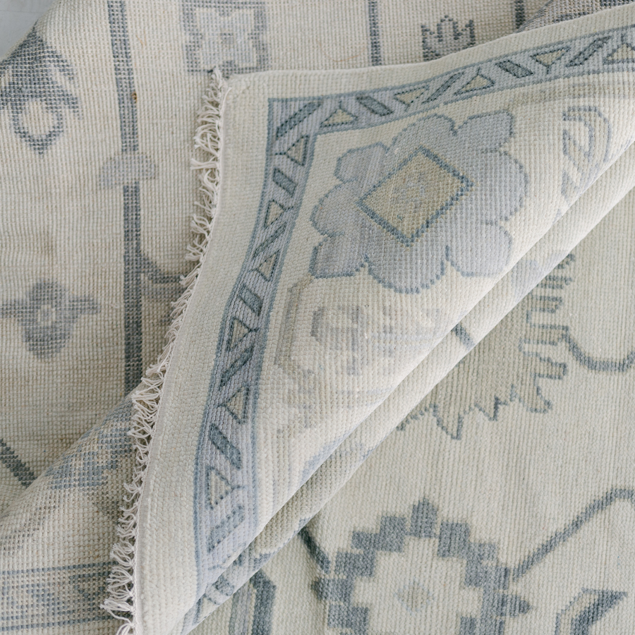
All blues are not created equal, so play with different shades and levels of saturation to achieve the look you want for your space. The blues in the Lauren rug pair well with neutrals like gray, beige, and metallics, like this gold lamp. Notice how the green sofa & greenery pop when paired back to the blue tones in our Lauren rug.
Even try using various shades and hues of blue as the main colors in your room to achieve the same effect as using several neutrals together. You could change the coffee table decor in this room or add more color through pillows and they would still work beautifully with the Lauren rug. Using blue as a neutral allows you to freshen up your space as trends evolve. More often than not, people opt for gray, white or cream for key furniture pieces for that very reason—the ability to change it up in a few years just by using different accent accessories. So, opt for blue and see how versatile your room will be.
Blue will carry and enhance other clors in your room while adding a certain energy - depending on the hue, vibrant or calm. Add blue to your home and see how it enhances your space and your mood!